Film distributors have a number of ways of showcasing their film to the target audience; multiple trailer forms (cinema/TV/teaser), posters, magazine exclusive and even publicity stunts to gather attention. In short, the better the film distributors in doing their role, the more likely the film is to make a substantial profit or at least gain a relatively large reach. The creation of a brand image means that your product is easily identifiable, for example, the Saw films have similar posters/covers and are widely recognised. Having a brand image means a distinct design of the movie title, or a house style throughout a trailer/poster/magazine.
Marketing is based on your target audience, and for a horror film the target audience is generally teenagers. Due to the boom in the use of social networking sites, web ads may be the most effective for this genre as teenager often spend hours at a time browsing. Also, these adverts are often teasers, which sparks interest in the film and so their research begins. This can then be followed by the video being shared and expanding reach. As the age group and target audience changes however, the content and methods also change. Poster locations for a horror movie will not be the same as that of a child's film. Colour schemes among other properties change between genre and audience, the following are some examples:
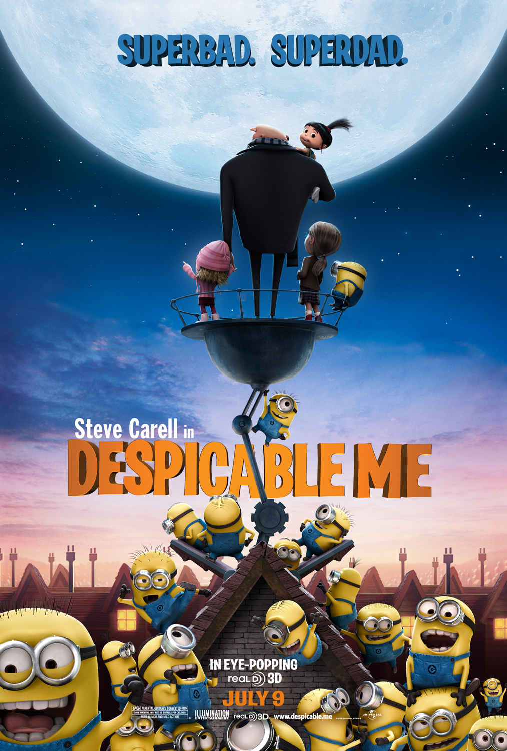 |
| Children's |
 |
| Horror |
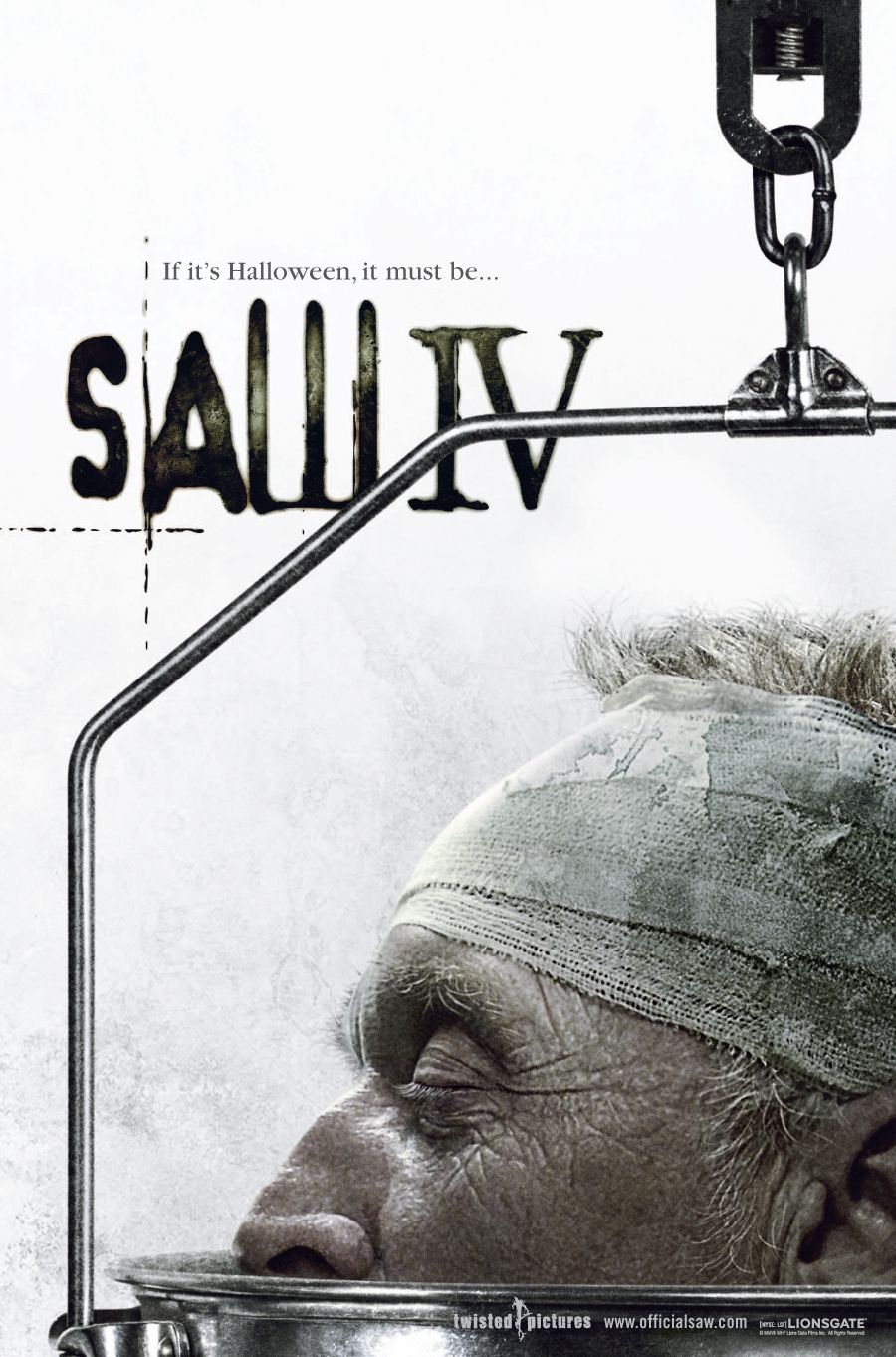 |
| Horror |
 |
| Children's |
The posters use different captions, all relatively short but the children's films use easily understandable phrases, while the horrors use dark, luring captions. Not only does the locations where posters are placed change between genres, so do the channels on which the adverts are aired. Horror trailer may be restricted during the day in terms of content and frequency, but at night they have much more freedom. Children's films can be advertised at any time of the day but will appear mostly on the channels that children will be watching. The variation in colour between posters is also very noticeable, as the horror films use a small range of colour (with minimal contrast) while the other posters use bright clashing colours to stand out.
A teaser trailer which successfully went viral was for The Possession. I think this was effective as it was used a joke on friends rather than an actual trailer. The title itself gives no hint that it is for a trailer, and so until the sudden twist, the viewer is oblivious. If a jump scare is achieved from this, it should spark an interest into the film and the potential audience have been reached. As a horror fan, a friend sent me this exact video, and I had expected it to be like the countless other "high" children at dentist videos, but I was wrong and it caught my attention.
Creating an identity for a film is important in the sense that it makes it easily recognisable for the target audience, a colour scheme, selection of fonts and styles all come together in order to create such an identity. As mentioned before, the Saw films have created an identity for themselves, their adverts and posters have a certain feel to them and so the viewer can quickly understand what they are seeing. This style carries on from the original teaser trailer, into posters and magazine covers until it finally reaches the DVD version, which often has a cover following the style. Each of these can contain various film reviews and awards on to flaunt the film's achievements to potential viewers, but as it is such a common technique to be rated "4 STARS" or something similar, it is rarely taken into account.
For Black Death, a certificate of 15 would be ideal but it would be more realistic to achieve an 18 rating. This is because the film having a lower classification would mean it is able to capture more of the teenage market, but due to some scenes of mild torture and gore it may not be possible. My poster uses an image of Meretta (Katherine) looking around, feeling she is being followed and the plague doctor behind her. This is a large part of the film's plot and so it was important to be shown in the poster. Also, the necklace has been brightened and distorted so that it stands out, indicating its' own importance. Horror movies tend to use dark and low-lit areas, and this is shown in the poster, however the trailer often lacks darkness. The title text itself looks as if it is becoming overgrown (as plants crop out from the bottom), which relates to the film itself because the majority takes place in a marsh.
Becoming the featured piece in a film magazine (especially one relating to your chosen genre) is a large step in promoting your film. Good reviews from credited critics can mean an increase in viewers because many people trust the judgement of said critics. Not only are you potentially increasing your viewers from those who regularly read the magazine, but if you reach the cover page, you are also reaching out to all those who see it in-store and this may spark interest.
 |
| My film poster |
 |
| Inspiration: The idea that she is followed and in hiding |
 |
| Inspiration: Colour scheme (tagline at top and house) |
-------------------------------------------------------------------------------------------------------------------
 |
| My magazine cover |
 |
| Inspiration: Layout and a colour scheme |
My cover was heavily based on the Fangoria, an American film magazine which revolves around horror movies. This was the perfect template for building my horror magazine on, they had a distinct style which I could recreate and apply my own content to. They use the same fonts and a general set of rules when it came to the colour scheme for each issue. The cover was created in the order of name, tagline, side features (film roll), main image, feature title, sub-titles and finally finishing touches such as barcode etc. Any tweaking of images was done in-between as and when a problem was noticed.
No comments:
Post a Comment